Santa Monica Brew Works Design
Since 2022, I’ve partnered with MGH to help assist in a variety of can and merch designs for Santa Monica Brew Works. I’ve had the opportunity to pitch ideas that lead to print, while some didn’t make it through. But across the board, they’ve been really fun projects that allow me to flex my love for Illustration and hand lettering.
Agency : MGH Advertising
Client : Santa Monica Brew Works
Creative Director : Dave Wassell / Jason Drumheller
Art Direction/Design : Ryan Stewart
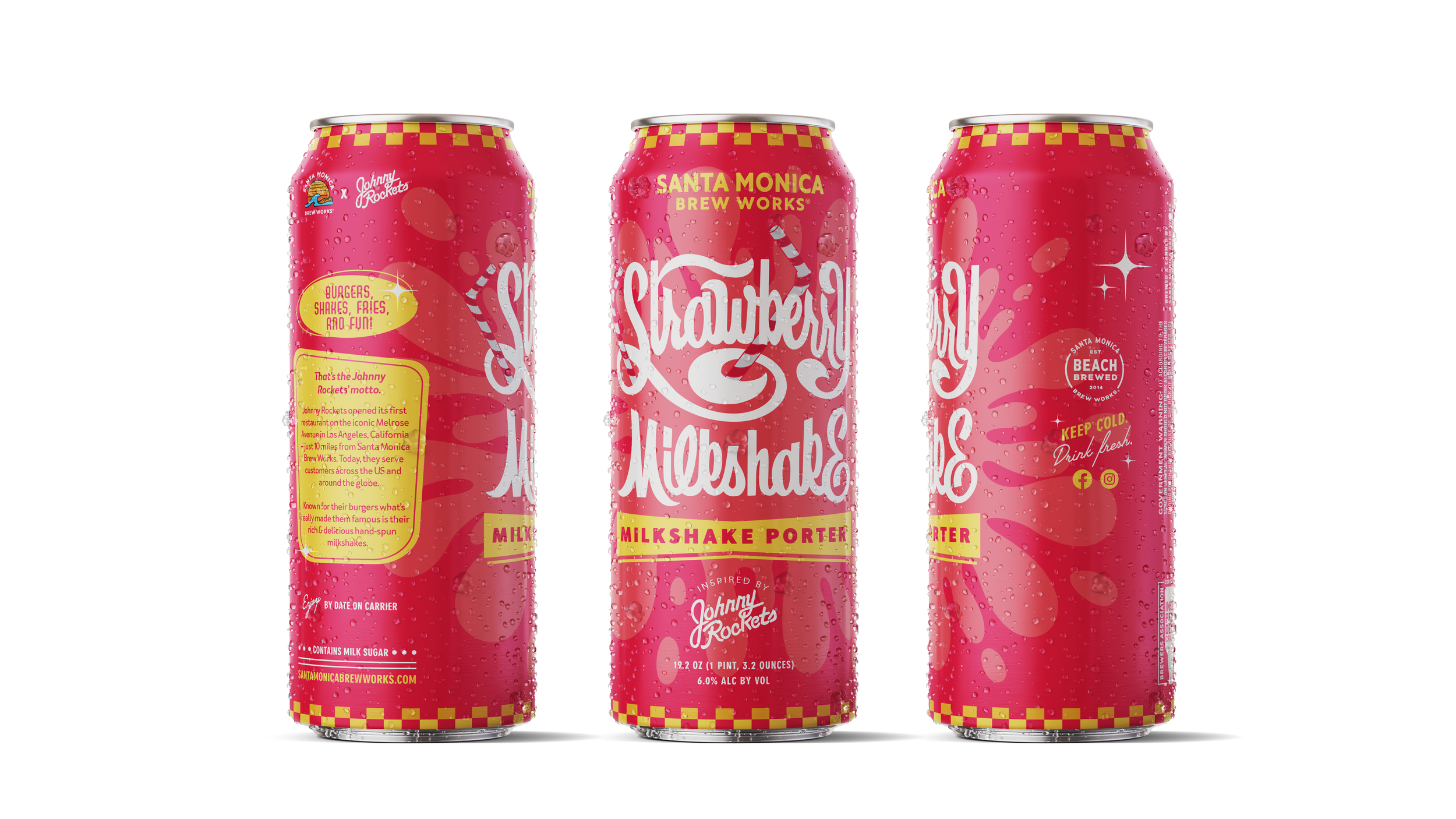
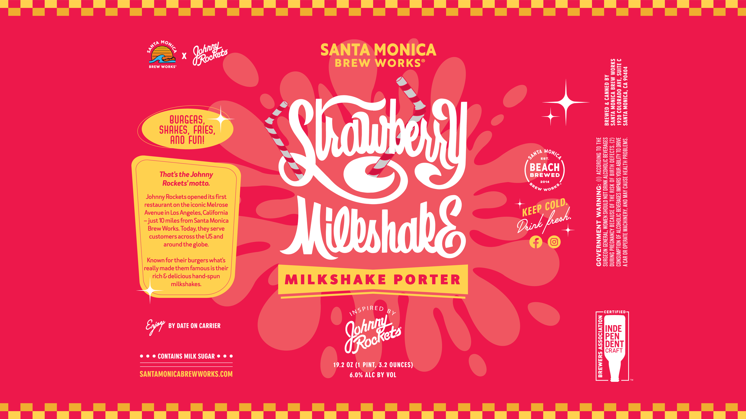
Santa Monica Brew Works x Johnny Rockets Collaboration
This took a fun and energetic hand-lettering approach. Letterforms were hand drawn and kept unedited when brought in to vector, to maintain a more authentic aesthetic. The various can elements were then added in, taking various cues from vintage 50’s and 60’s American Diners. These did not make the final cut, but I loved how playful and dynamic these ended up being.


Dark Gold Black Lager Can Design
This project had a few fun stages. I typically approach a project like this providing the client 2-3 different designs that vary anywhere from safe, to full blown weirdness. For the first round, I choose these 2 to lead with, with one being a more traditional approach, with the other leaning heavily into some more custom illustration.
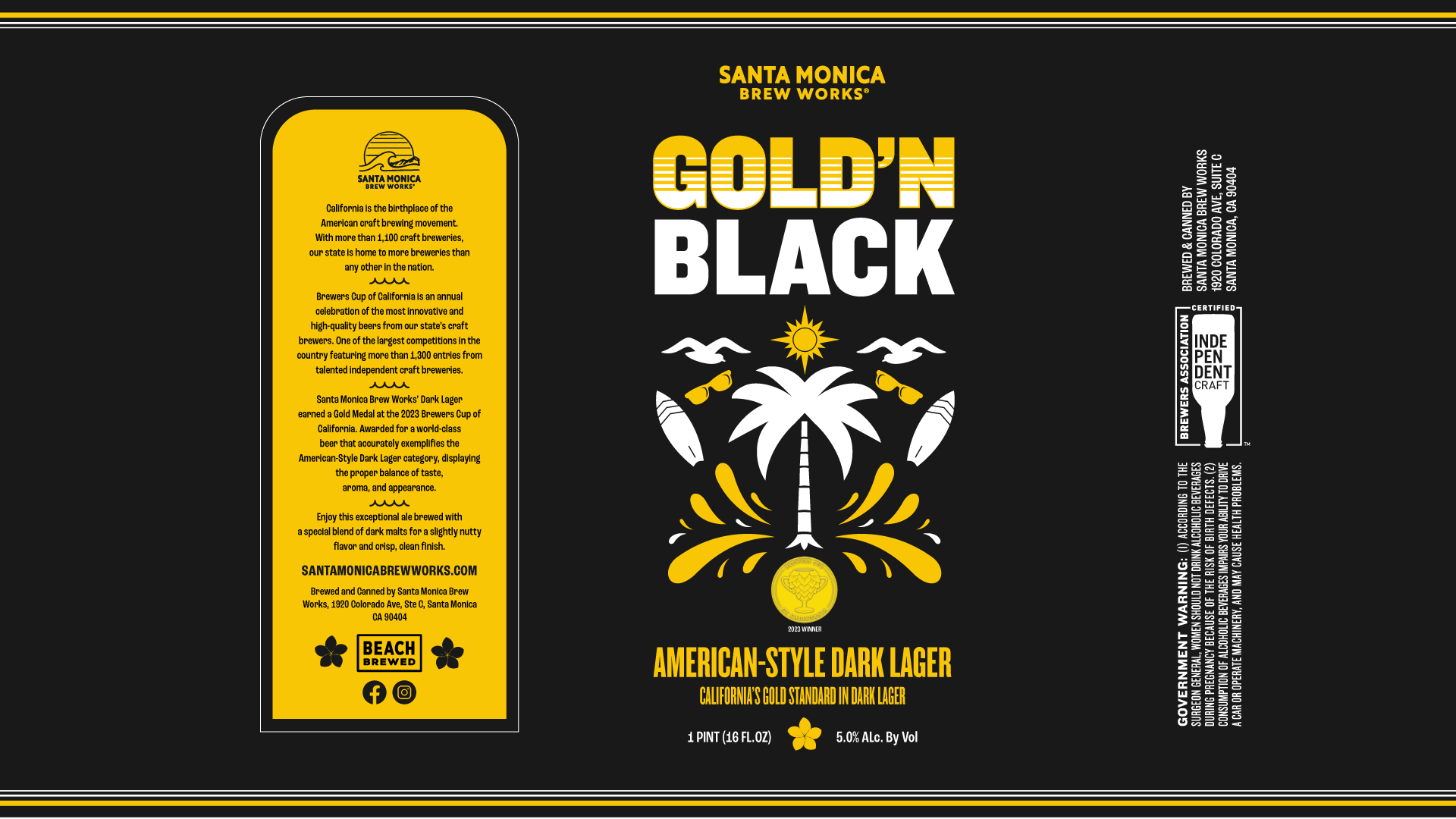
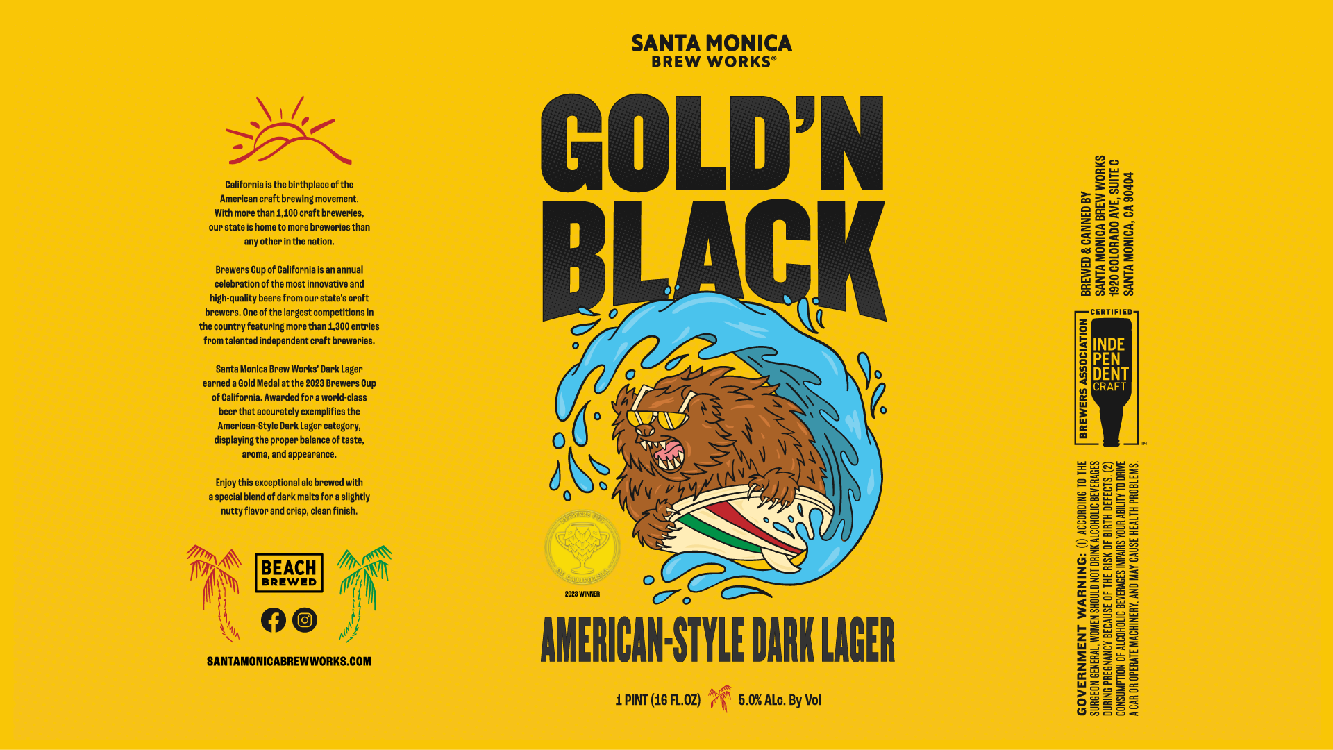
The first option was designed in a flat vector style, leveraging the black and gold color palette for maximum pop. The medal asset was used as part of the design, but remained secondary to the rest of the can. Second option has a hand drawn illustration approach featuring a surfing bear. I figured for this option, to use the Gold aspect of the name as a cue for the entire can to be in that color, while text and art can be full color/black for nice contrast. Ultimately the client liked option 1 more with some tweaks.
Below are the final results that were ultimately chosen and printed. The medal became more of a focal point when worked into the main design. From there, we adjusted the name, and gold colors to appear more naturally gold looking. The client was really happy!

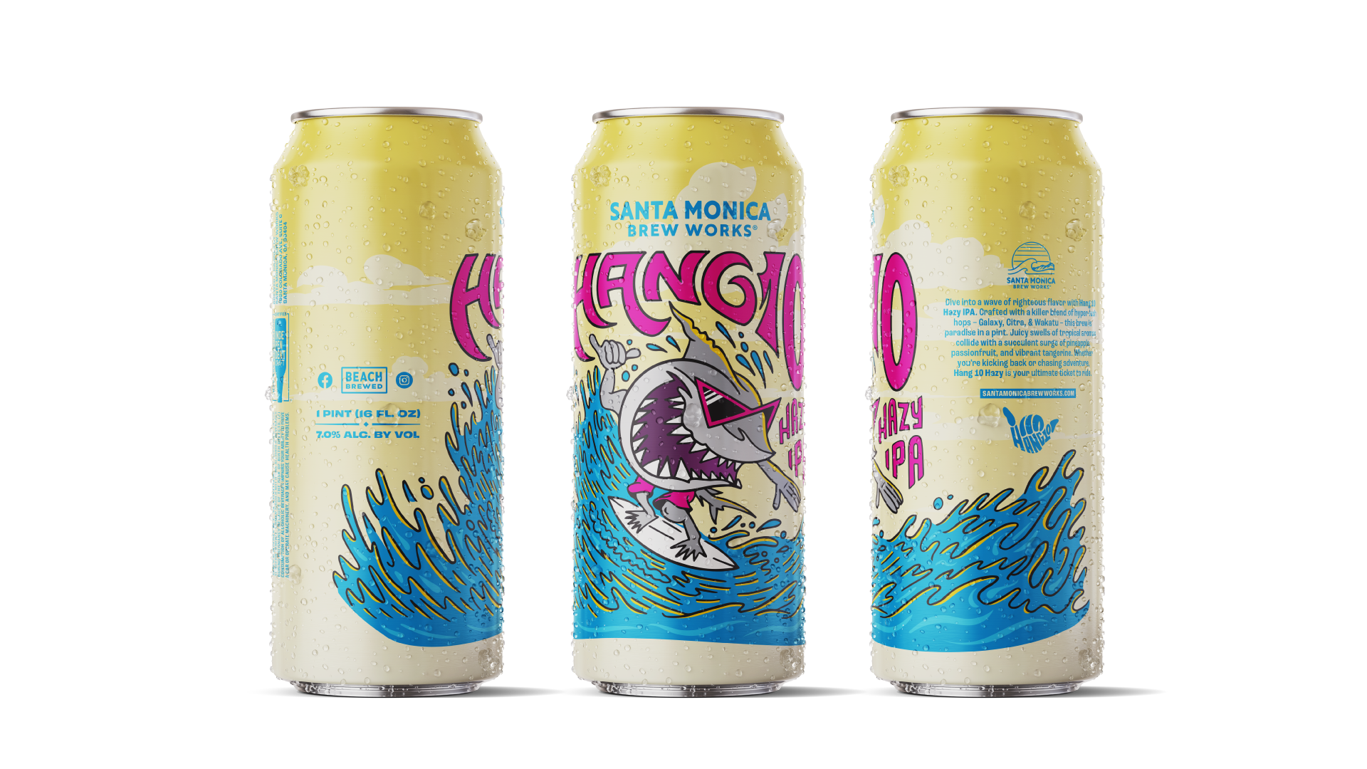
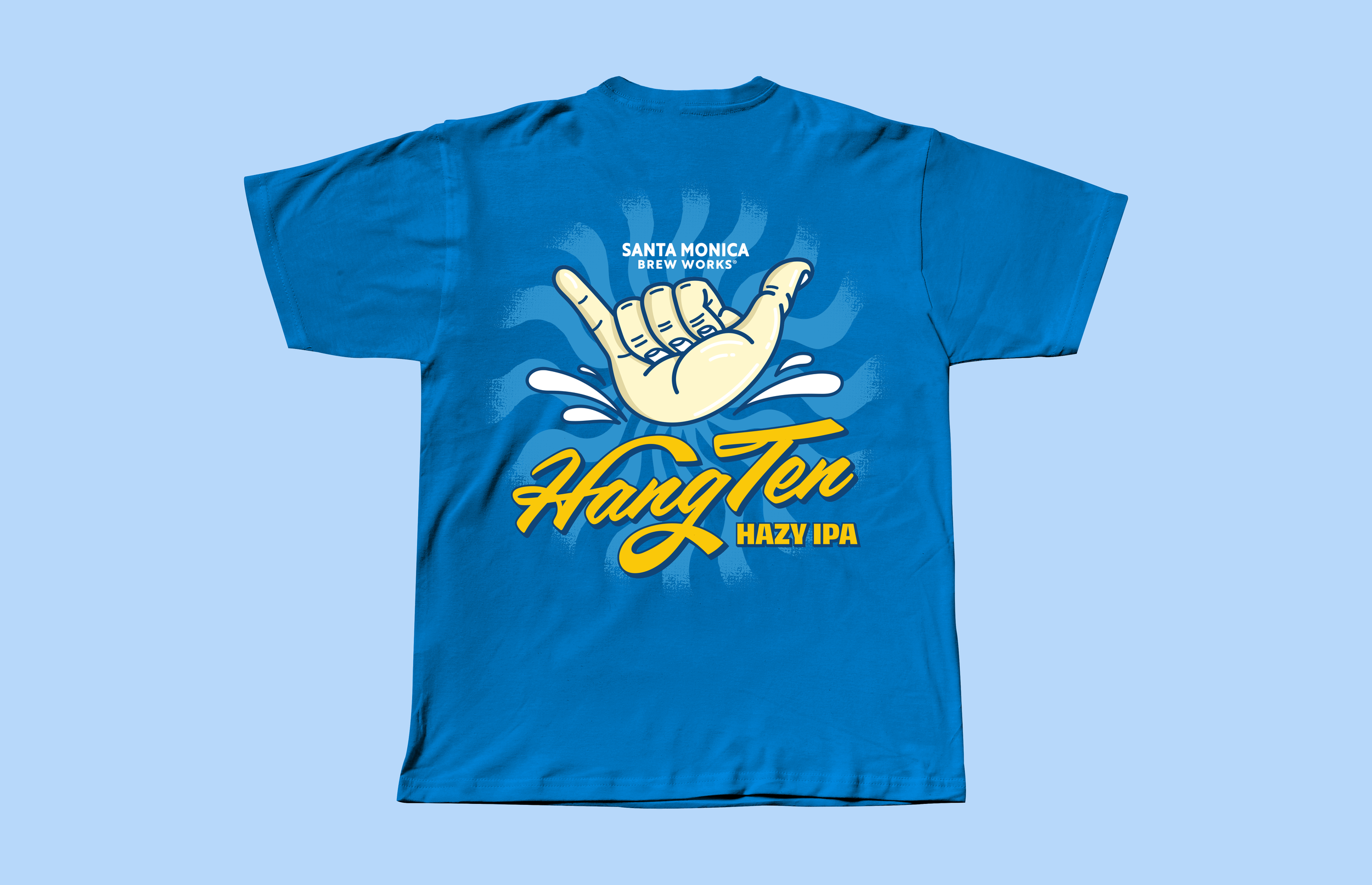
Hang 10 Hazy IPA Can Design & Merchandise
To celebrate their 10th anniversary, Santa Monica approached us about creating an exciting can design to celebrate their milestone anniversary and release of a new special Hazy IPA for this celebration. The client had asked if we could incorporate a Shaka Hand visual into the final design. I felt there were no better way to include that, then with a kick-ass shark surfing. From there, I built out some merchandise that leveraged the shark from the can, as well as some outtakes we had shown the client as can designs, that had a new life as shirt graphics!

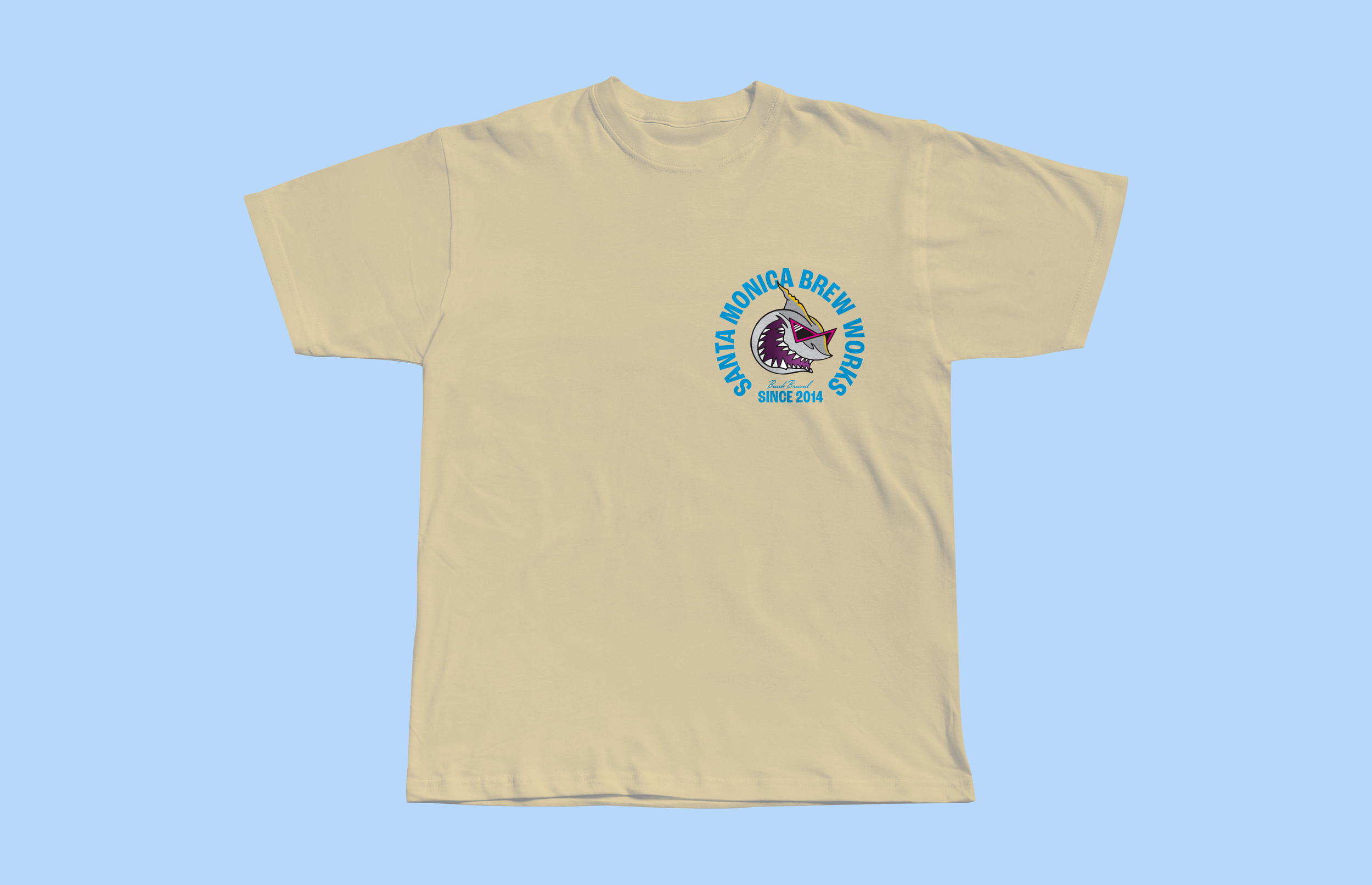


Branded Merch Design
In addition to cans, I was also able to help update some fun merch options for their flagship brewpub. The brief was to create 2 designs, one being 70’s retro inspired, with the other being Vaporwave/Cyberpunk inspired. I had fun with both of these designs! A really great exercise of using gradient textures, and creating some fun and funky custom typography.


